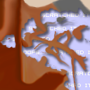
This tile is from Newbies 10: Practice makes... black lines on the edges of your tile
Tile Info

Comment: oops.. scratched it....
By: Norjee
Checked out at: March 11, 2002
Checked in at: March 11, 2002
Checkout tile:
In Context
Posts
Next time
Remember to continue the shapes from the borders you're given, not just the colors. You did this with the bottom of the disk, but not the wood paneling next to it.
Re: Next time
I don't see anything wrong with the tile except the black line at the top. I doth think Black protests too much at times. Continuing the shapes from the boarders, they did just fine with what I saw in the borders. How were they to know that was a disc anyway if they got the tile before the top one was visable? Personally, I didn't see that was a disc untill you just said it here. There is no defining line except maybe the little black sqaure in the corner that tells me it is a disc. It should have had the indent in the plastic where you place a lable and the words that tell you how much space is on it in the metal peice that protects the disc and slids over when it's put in the drive, that would have given me the impression it was a floppy disc.
Re: Next time
I didn't recognize the brown thing as wood.. I just copied the gradients en bended them.. Can't see what's wrong with that.
As for the line ontop, that is NOT in my tile, but in the one above me.
As for the line ontop, that is NOT in my tile, but in the one above me.
Re: Re: Next time
Well I'll back you up on the line thing, MY tile to the right of that disk also suffers from DarkDevil's line.
However, what I think Chris is saying and I agree with him in this is that you should have curved the gradient you blended from above, you could see how the edge of it was curved and that it wasn't a gradient going straight down so you should have continued that direction.
There is nothing wrong with your blend itself, you haven't left a visible border but the shape created above changes direction very sharply and suddenly, that's the problem.
Nice tile otherwise, very interesting shapes and nice shadowing. :D
Right, I just phrased my comment wrong
But what else is new?
Anyway, yes, the change is too sharp right there. Sure, sharp changes are fine; too much wavy blubbery stuff in tiles can get boring. But doing it right at the edge of a tile hurts your blending, even if it was your intention. It's best to limit that to 1 shape or less, and continue the lines into your tile somewhat before a sharp turn, or all of the way.
As for the wood and disk, I didn't mean you needed to recognize it. Guessing your borders is most of the fun of this site. I was using them as examples to illustrate my point.
As for protesting too much, well, I'd consider it constructive criticism. I point out areas in tiles that could use work, in the hopes that the artists will improve on these in future tiles.


![It all meets here... What a mess! by [DFXP]SPiRiToFCaT](https://s3.amazonaws.com/static.ice.org/quilts/quilt_74/current/11801.png?AWSAccessKeyId=AKIAJPNRWEFB3VFDG6FQ&Expires=1762429747&Signature=xgZbeJkv64fF3fUappqGkBDyRcM%3D)


![Toxic Waste Sucker and wierd brown stuff. by [DFXP]SPiRiToFCaT](https://s3.amazonaws.com/static.ice.org/quilts/quilt_74/current/11743.png?AWSAccessKeyId=AKIAJPNRWEFB3VFDG6FQ&Expires=1762429747&Signature=gkQr2LtYML%2F0rCvoBVaLxR0bKWU%3D)
