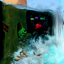
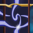
This tile is from Newbies 32 - The Next Generation
Tile Info

Comment: Puzzeled on blending with the tile above...
By: Miryenne
Checked out at: March 23, 2004
Checked in at: March 24, 2004
Checkout tile:
In Context
Posts
classic
the impossible cube... just classic. :) Nice job overall. You blended well with the tile to right and it looks like you did a good job with my tile to the left. As far as tips for blending with the tile above, it looks like part of your problem was dark pixels right along the border where the artist may have accidently stopped short of the edge. One strategy that helps sometimes is to repeat those dark spots several times into your tile. Try making a pattern out of them. At very least this can create confusion about where the edge of the tile is. Other than that, keep trying; try to figure out how the tiler next to you created the effect that you're looking at. This is a great place to learn new techniques.
Re: classic
I'm glad you like the cube - I wasn't sure what people would think of it.
I find it easiest to blend with the gradient type edges and I just could not find a good way to work with the upper tile. But I think I get what you mean about patterns - I will try that the next time I am stuck. Thanks.
I find it easiest to blend with the gradient type edges and I just could not find a good way to work with the upper tile. But I think I get what you mean about patterns - I will try that the next time I am stuck. Thanks.
I did the one above
Yeah, there's some ugly pixels at the lower corner. I didn't see them, sorry :\ - But it looks like you did manage it after all! :)
By the way, you could have let one edge of the cube reach out of the tile, as to encourage the next tiler to develope something out of it (makes me think of what I didn't do above...well, it's always easier to critizise other tiles after all :])
By the way, you could have let one edge of the cube reach out of the tile, as to encourage the next tiler to develope something out of it (makes me think of what I didn't do above...well, it's always easier to critizise other tiles after all :])
Re: I did the one above
I think in the end our tiles work together.
I tried to move the cube so that the corner went outside of the tile but I could not get the positioning right so in the end I gave up and went to bed. Now that I look back at it I wish I had added a tentacle or something woven through the lower half of the cube and leading off the tile. Oh, well some other day.
I tried to move the cube so that the corner went outside of the tile but I could not get the positioning right so in the end I gave up and went to bed. Now that I look back at it I wish I had added a tentacle or something woven through the lower half of the cube and leading off the tile. Oh, well some other day.
Negitive Score
Could whoever gave me the -3 please tell me why?
There are things on this tile that I wish I had done differently but I do not see anything that is so terrible as to deserve that low of a score.
Thanks
There are things on this tile that I wish I had done differently but I do not see anything that is so terrible as to deserve that low of a score.
Thanks
Re: Negitive Score
I like it :) 5 from me!
Re: Re: Negitive Score
Thank you so much!
And thank you to whoever changed/got rid of the negitive score.
And thank you to whoever changed/got rid of the negitive score.
Re: Negitive Score
Don't take it personally... Some people are jealous of your tiles so they give you minus scores.
I personally have 3 tiles with -3 and -4 while everybody else gave it 3 and above.
Oh and if you get a -5 score it could be Google voting automaticly (don't ask).
I like your tile, it looks great and it blends great. The blending with the top tile came out great if you ask me. keep up the good work!
Re: Re: Negitive Score
Thanks for all the praise.
At first I really hated the blend at the top but now that I see it in place on the quilt I like it a lot better.
At first I really hated the blend at the top but now that I see it in place on the quilt I like it a lot better.

