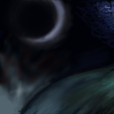
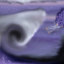
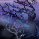
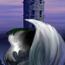
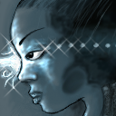
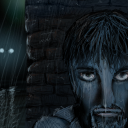
you've had much better tiles. This one seems oversimplified and looks to be rushed. You only spent about an hour on it. It's also a good idea to stay away from black backgrounds in tiles - leads to a feeling of a bunch of little pictures suspended in space with no connection to one another.
3
This tile is from I've Got the Blues [Color Theme]
Tile Info
In Context
Posts
Dude
Re: Dude
yea I know... but the stuff I had to work with kinda gave me that black background... or I could have continued with the gray... wich I didn´t like at all.. yea, I have to admit that it's somewhat rushed, and I really don't like the black backgrounds either.. but I couldn't come up with a better idea.
Re: Re: Dude
Nah... I really liked it... you won't believe how nice it will look with the tiles I've created...
It will look like a picture streching over (at least) 4 tiles...
Besides, just because there is'nt all that much in the picture, it isn't bad... emptiness is nice sometime... I'm gonna go for a ...
4!
It will look like a picture streching over (at least) 4 tiles...
Besides, just because there is'nt all that much in the picture, it isn't bad... emptiness is nice sometime... I'm gonna go for a ...
4!
