This tile is from Newbies 36: Cadillacs, Blue Jeans.
Tile Info
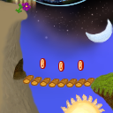
Comment: Mario's Cave
By: Miryenne
Checked out at: December 21, 2004
Checked in at: December 21, 2004
Checkout tile:
In Context
Posts
well
I don't know why this has a negative score, at least you blended it well, you just need to spend more time on it I think. I am giving you a 2.
Re: well
I assumed that the neg vote was from the google bot as it has been in the past.
I am curious though what you think needs more work. I don't have great artistic skills (please feel free to look at me past tiles) and I do know that I can improve (and I hope I have since I started tiling) but I do my best to make the best tile (I can) for the quilt.
Sorry if the following is excessive but if you are going to be critical please also be specific. Everyone could spend more time on their tiles but unless there is something to focus on, it would be a waste of time. So, I guess what I am saying is if you think I should spend more time on my tile then please also suggest an area I could improve on.
To explain how I devolved this tile here are the steps I took and the choices I made.
- I hated the solid brown/tan coming from the left side so I choose to end it early in the tile. Because the connecting area below was already angling up, I choose to make it a cliff.
- I then completed the items on the other three sides. (Sun, Island, Top design)
- While filling in the background, I noticed that the right hand side had discolored edge between the black to blue transition. So, I added the moon to disguise this and continue the theme from the tile below.
- The cliff looked boring so I added a cave. Since the grass island reminded me of old video games, I kept it simple.
- I decided the cave needed connected to the island so I added a bridge. I choose to make it look like the silly floating log bridges from the Mario games. After that, I still thought it was too empty so I added the coins.
- The top of the cliff made me think of Seuss books and it just seemed to need a flower. I really liked how the continuation from the tile above looked like a picket fence behind the flower.
- I thought the upper third on the tile needed a little more so I added stars.
- I considered adding more to the tile (clouds, flying things, balloons) but I decided there was enough already and it didn't need to be any busier. Especially since it is a four-sided tile.
~M~
Re: well
Voting always seems to be a little rough on newbie quilts. I think the tile works out great with the rest of the quilt. You had some fairly problematic borders to work with (e.g. the contrasting colors and elements at the corners) and you solved the issues seamlessly. You don't need to make any excuses for your artistic skills.
The only improvements I can think of would be to add some more texture or shading/highlights around the mouth of the cave to make it look more 3-dimensional. Although that may have ruined the Mario look you were going for.
The only improvements I can think of would be to add some more texture or shading/highlights around the mouth of the cave to make it look more 3-dimensional. Although that may have ruined the Mario look you were going for.
Re: Re: well
Sorry I didn't elaborate.
Think of making your objects more "3D." To do this, always have a shadow area, midtone, and highlight. To make it really pop out, use rim lighting or whatever it is you call it. this is a light area after the shadow. This is hard to explain without a visual aide. If you have any questions, ask.
Just keep practicing and your tiles will get better, the more time you spend on each tile, the better it will be.
