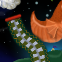
This tile is from Newbies 32 - The Next Generation
Tile Info

Comment: My first tile...a salute to donuts.
By: supercrutch
Checked out at: April 08, 2004
Checked in at: April 09, 2004
Checkout tile:
In Context
Posts
Nice start
First, it's very good how different your tile is from the border you were given -- without any abrubt changes. I like the fish, too. Still, there's a few things that could be improved. The plain gradient is far too obvious; try to disguise a gradient as much as possible, if you use one at all. Also, leaving a huge swath of pure black -- even broken up with interesting stuff, as it is at the top of your tile -- makes for uninteresting blending and unappealing sections of a quilt.
Re: Nice start
I agree with all of those points. This was my first attempt at a tile, and when I submitted it I thought it looked fine. However, once it was finally added to the quilt, I realized there was some room for improvement. I like the tile above mine by StinkFist, who did great with very little to work with from mine.
The only point that you made that didn't occur to me was about the gradient. I never thought about it until you mentioned it, but it makes sense. No more gradients!
The mermaid tile also has some gradients and black involved, while my tile at the top of the quilt has some blending issues that irk me. I'll get the hang of it sooner or later. (Hopefully.)
do not fear the gradient ;oD
nothing wrong with using the gradient [or any other tool] as long as it's not blatant. the gradient was a good start here for your sky. you could've painted on top of that, or added some texture or detail to the sky after using the gradient though, to make it less obvious is all.
fun tile btw :o))
fun tile btw :o))
