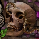
I must know, as since I do not, how are you rendering that rope?
I have seen the same rope effect in so many of your tiles.
It was nice, but now it is getting old. Can you modify it?
Change the colour, the size, the light source?
What software are you using that does that?
Nice skull. You drew that right?
I know you have said your
drawing blows chunks, but I beleive in you.
I'll give ya a four.
Love ya
-Ken
This tile is from Attack of the 50 Foot Mainquilter!
Tile Info
Comment:
Deadly geometry
By: LongIslandEddie
Checked out at: October 13, 2001
Checked in at: October 14, 2001
Checkout tile:
In Context
Posts
Enough is enough.
Re: Enough Rope...
Ken,
There are a hundred and seventeen tiles of mine here on this page and that rope that you speak of is in , I believe 5 of them. I got into the rope thing when I went onto the Knots quilt and just fell in love with it. I call it a "rope trick" or sometimes, like Muhammad Ali, my old "Rope-a-dope"...See? Now, as to the software, it's Corel and as good as any competitive software out here! What color rope would you like? As a matter of fact, I'll do you a tile, in tribute to your observation, name your rope! As to the skull, it is effective, isn't it! Funny to think that God invented the common skull and man has been proudly using it for eons. Like most talented artists, I learn to start with a model and work outwards to develop an image with impact, whether through shading or contrast, I work that image to the hilt and when I've done my thing, it's mine, all mine! I slid the rope through his eyesockets to make it harder for the artist who wants to lift the skull to insert in his archive. Incidentally, it's good to see you back and I'm waiting to see your new line of tiles! Best regards, Eddie M.
There are a hundred and seventeen tiles of mine here on this page and that rope that you speak of is in , I believe 5 of them. I got into the rope thing when I went onto the Knots quilt and just fell in love with it. I call it a "rope trick" or sometimes, like Muhammad Ali, my old "Rope-a-dope"...See? Now, as to the software, it's Corel and as good as any competitive software out here! What color rope would you like? As a matter of fact, I'll do you a tile, in tribute to your observation, name your rope! As to the skull, it is effective, isn't it! Funny to think that God invented the common skull and man has been proudly using it for eons. Like most talented artists, I learn to start with a model and work outwards to develop an image with impact, whether through shading or contrast, I work that image to the hilt and when I've done my thing, it's mine, all mine! I slid the rope through his eyesockets to make it harder for the artist who wants to lift the skull to insert in his archive. Incidentally, it's good to see you back and I'm waiting to see your new line of tiles! Best regards, Eddie M.
Re: Re: Enough Rope...
Sorry if I sounded harsh, the rope effect sticks out so strongly, it seems to lift out of the tile taking away from what you have created. This unfortunately wreaks havok with my brain and five is enough to make me notice. Like a red dot on a green field.
I can still lift out the skull and edit out the rope if I wished.
I have been busy sending out resumes, looking for work, going to interviews and getting nothing.
I haven't had my heart in these tiles lately so they are a little off.
Tell me more about this effect in Corel, which version? I have only Corel Suite 7 as where my tiles come from. After that I just haven't bothered upgrading, but with such a nifty tool like that I might like to see what I can make it do.
Yeeaaah COREL!
Later
-Ken
Re: Re: Re: Enough Rope...
Hi Ken,
Yes, no offense was taken because you are right about the rope and altho it's a good rope, too much of a good thing is a bad thing. I'm glad to hear that you've got Corel7 because there isn't alot of difference between seven and nine where it sits now (I think). To create ropes, you need to be using the image sprayer, (the spray bomb on the toolbar,a flyout from the paintbrush). When you double click the icon, a dialogue box appears and allows you to use a preset tool or effect. Choose "Brown rope" from the list of options and using the tabs at the top of the dialogue box, start setting up the parameters as follows: Dab variation,first tab at top of box, set this at 5 or six, it will set the number of strands for the rope. Set the spacing to the number of spaces(between strands) between the individual strands of your rope. Go now to the next tab,to the right, the one that shows an orbital looking icon and drop this box down
and put a check mark into the box that says" Enable orbits", the orbits are the twisting of the strands of cord which form the rope and try setting this value at 4 or five. The next parameter to deal with is the radius and the smaller that you make the radius, tha tighter the rope will be if you use a large value(in pixels), the rope will have a hollow center and you will be able to see thru the spaces between the strands. If you use a lesser value(no. of pixels in the radius), the rope will be tighter. You really have to experiment with the image spraying tool because in addition to all of the preset effects, there are an infinite number of variations within each of these presets and it always depends on which effect that you want to achieve when you use it. I like working on a black background because the contrast is maximized, especially when I am drawing lighter colored objects, so open a new sheet with a black background and then start to work with the tool. Try some of the other stunning effects that are offered among the presets. To color the rope, you must mask it and then make an object of it where you can change the color values to give you whatever you want and when you've done this, combine your object with the field or your image. I am looking forward to seeing how you bring this great tool into your work and certainly hope that things get better for you as far as your economic situation. I miss my old job and am avowed to holding out here on my desktop for as long as I can before going back down to the saltmines for another stint. Thanks for keeping in touch Ken and again, I hope that all is well with you. Eddie M.
Drawing?
That is a photo, look closely. Not bad though. Cool effect for the quilt.
TCM
TCM
Cool
You are great at art, and also at blending backgrounds you are given. I know this is just a small part of the tile, but how do you effectively blend things like that dirt ground you were given?
Re: Cool
Shiro,
The background that I've blended here has been directly lifted from the tile that provided the border, I windowed it out and placed it within my own boundaries but blended little more than the row of pixels which came against the original border. My tile was completely done to match the bottom border because I lifted only the color value as there was no detail to repeat. I mottled the background then with geometric shapes having the magenta value, black and shades of the original brown background but did not run my image to the border. I did obtain a clip of a skull and on a separate file, made distinct changes to the physiognomy of it as well as the shadows and accentuations. I changed the gamma (contrast) and the coloration to range in the brownish tonal value that was already there in the background and then I threaded the rope thru the eye sockets simply to offset the stark and lonely skull. We have the greatest latitude when there is only one border on our tile because we get to set the borders for three neighboring tiles and there, blending falls upon the shoulders of others. I don't feel that by using a clip art image as a basis for my work, that I am forfeiting my right to be considered an artist because I have understood art to be a thing of the eye as well as of the hand, that which is composed to look right, is right. Although there are purists out here that want very much to discipline others to be originating their own creations within a tile, I believe that a composed tile, down to the placement of all thirteen thousand pixels, each in it's own place, makes any contribution to this quilt, a valid contribution whether to teach us what to do or what not to do. Please do not let me discourage you from developing the skills that will take you to a higher calling but rather let me get you to understand, that Art by any other name is still art. As to beauty, that is in the eye of the beholder! Thanks for your post Shiro.
Eddie M.
