This tile is from Finally! The new site!
Tile Info


Comment:
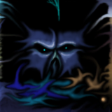
Lots of snakes and worms...here's my homage to the master
By: MrScrappy
Checked out at: April 02, 2001
Checked in at: April 03, 2001
Checkout tile:
In Context
Posts
er?
Judging from the early scoes, this one didnt go over nearly as well as i had hoped. Has my all-too-trademark brand of 2d/3d become passe already? Or have i offended someone to the point of sabotage? Madre de Dios, someone talk to me, what can i do to regain public favor?
re: er?
i think it looks great, dunno whats up with that
Re: re: er?
Yea, it´s real cool! worth atleast an easy 4!
Re: Re: re: er?
Ah, well...whatever. I'm not making these to please the masses.
=)
Well done, sir!
I know why...
It's those private quilt people getting back at you for not participating in the "cool" quilt. It's the private quilt people who run this joint...the public quilt people are just pawns in the big quilting game.
Re: I know why...
As much as I enjoy the paranoia, that's simply incorrect. I did all of the code on this site, and I don't run the invite-only quilt. That's entirely root88, who is an ice member, but does not run ice. He is just a really motivated artist who wanted to get the people who are obsessed with quality together to see what they could do.
I know you're kind of kidding, but I just wanted to be clear on this point. If you're happy drawing on this quilt, then by all means draw here and don't participate in root88's quilt. At the same time, understand that he wants his quilt to be successful, so he's trying to rally the troops, so to speak :)
Jon/Slothy
Re: Re: I know why...
But of course, it was just my attempt to be silly. Why didn't I use the damn smiley face...Why! Why! Light-heartedness is a foul temptress!
Seriously though, I was aware of these things and hope that those who are and are not part of the invite only quilt understood that I was only poking fun at MrScrappy , whom I work with, from his frustration at low-ball voting.
Seriously though, I was aware of these things and hope that those who are and are not part of the invite only quilt understood that I was only poking fun at MrScrappy , whom I work with, from his frustration at low-ball voting.
Bad blend
I understand your frustration about the tile to the left of this one (and to the right of another tile of yours). That's why we made the invite only quilt (which you are invited to). =)
Very nice art, but poor blending.
This is a good example of a tile that would benefit from having 2 seperate votes cast upon it. Your artwork is great, but you made no attempt to progress the theme of the tile below yours.
Artwork vote: 5/5
Blending vote: 1/5
Artwork vote: 5/5
Blending vote: 1/5
Re: Very nice art, but poor blending.
Spoken like a true novice. Using what i was given, I echoed the black and white pattern up and around into the worm. You might want to get a pencil and paper here...
Not every continuation needs to be in a straight line. Lord deliver me from the persecution of the blinded literalists. Any schmuck with a cloning tool and the ability to copy and paste can continue a pattern through a tile. The art here is learning to pull a more subtle flow from the shapes and hues. Something that takes a little thought. The result was a curl that began at the car door and wrapped up into the head of the beast.
Not every continuation needs to be in a straight line. Lord deliver me from the persecution of the blinded literalists. Any schmuck with a cloning tool and the ability to copy and paste can continue a pattern through a tile. The art here is learning to pull a more subtle flow from the shapes and hues. Something that takes a little thought. The result was a curl that began at the car door and wrapped up into the head of the beast.
Re: Re: Very nice art, but poor blending.
I agree with MrScrappy
Re: Re: Very nice art, but poor blending.
"Spoken like a true novice".... :) Well thanks for the compliment there buddy, but I wasn't trying to insult you in any way, so chill a bit. You complained in your first post about your score being so low. The fact that it doesn't appear to blend that well, I'm sure is the reason why it was that low. So if you don't like hearing criticism, then don't make posts complaining about your low scores. Because when I see a post like that, I feel obliged to make a reply justifying why I voted the way I did. I gave you a 3 on this one by the way. While on some of your other tiles I gave you 5s.
And yes I could see that you tried to blend the tail of the snake with the top of the dude's head. But what I didn't like, is that you placed your 3D image above the B&W 2D image without blending the 2 mediums together.
And yes I could see that you tried to blend the tail of the snake with the top of the dude's head. But what I didn't like, is that you placed your 3D image above the B&W 2D image without blending the 2 mediums together.
Re: Re: Re: Very nice art, but poor blending.
Actually, If you want to get technical (which I always do)...I did. The first 2 and a half rings of the worm are 2d, drawn by my own pretty little hand In good ol' PS. I increased the light falloff and modeling as i merged into the 3d portion of the creature from a flat white (bottom ring). If the transition was not dragged out long enough for your tastes, well...art is a subjective thing.
Re: Re: Re: Re: Very nice art, but poor blending.
I know why I thought your snake didn't appear to blend with the other tile that well. Someone just reminded me in another post that my gamma was set too high, after turning it down a notch. I decided to have another look at your tile, and this time it does look rather good. The bottom link of the snake NOW looks black so it does blend with the tile below it. Try turning your gamma up in your graphic card's properties and you'll see what I was seeing. The bottom link of the snake is not the same intensity of black as the tile below it, so when you look at it with a higher gamma setting, it looks just as gray as the other links in the snake, so to me, it looked like you just placed your 3d image right on top of the one below it without attempting to blend the two. Sorry about the confusion there.


