it reminds me of some old 2d-shooter/jumpnruns, when a level changed into another one. ;)
But this is just a quilt, and those borders looks interesting and it seems not as hard to made something more interesting out of it.
This tile is from Newbies 20: The Dodecahedron of Newbie Quilts
Tile Info

Comment: My First Works......
By: myndgame
Checked out at: December 28, 2002
Checked in at: December 28, 2002
Checkout tile:
In Context
Posts
hehe
well...
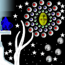
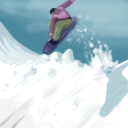
at least the "artist" put some effort in it, but he failed almost completely to get an even blend from the other tiles (yeah, except from the 100% white and the 100% black). The border are too obvious, you did not work with the material that was given to you.
can anybody say
Not everyone who starts tiling leapt from the womb with a wacom stylus in their hand. The whole point of the newbie quilts is to let people try it out and develop their skills. It really isn't a good place for negative scores and bad attitude. I've been around this site for around 18 months now, and I've seen quite a few people grow from this sort of style and level into really excellent tilers - it really doesn't seem to take all that long.
The blending on this tile isn't great where the gradient is, but gradient blending is damn hard to do - particularly with a mouse. If it were me, I would also move the encircled head up and to the right a bit, so the outer rings go off the edge of the tile giving the neighbours a bit more to play with. Generally, the white and pale blue theme could have been used more in the tile but combined with the black at the bottom it's not the worlds easiest set of edges. Also, the use of multiple repeats of the same image - stamping - is something that I would discourage. I know it makes the tile go quicker, but speed isn't the point is it?
The blending on this tile isn't great where the gradient is, but gradient blending is damn hard to do - particularly with a mouse. If it were me, I would also move the encircled head up and to the right a bit, so the outer rings go off the edge of the tile giving the neighbours a bit more to play with. Generally, the white and pale blue theme could have been used more in the tile but combined with the black at the bottom it's not the worlds easiest set of edges. Also, the use of multiple repeats of the same image - stamping - is something that I would discourage. I know it makes the tile go quicker, but speed isn't the point is it?
Actually....
There Was No Stamping :) Thats A Custom Brush I Use :)


