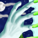
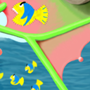
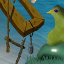
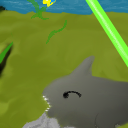
What a cute fella :)
I think you managed to put a great expression on his face, even though most of it is hidden behind the "bars".
This tile is from Newbies 11: No Black Borders!
Tile Info
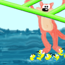
Comment: Tile #5 - PacMan missed a few
By: TexanPenguin
Checked out at: April 02, 2002
Checked in at: April 02, 2002
Checkout tile:
In Context
Posts
Awww
Re: Awww
Thanks. It's hard to draw with a mouse when you are used to pen and paper. If only I had a tablet.
Re: Re: Awww
Wow! That's really impressive then - I know the horrors of drawing with the mouse... *hugs tablet*
Do you work in Photoshop or another program that has layers? Because when I had to draw with the mouse I was very dependant on layers to compensate for the lack of control and my images tended to look very "layered" (not to mention my horrible overuse of the selection tools and effects on the layers *shudders*) - I don't think that's the case with your image, though.
If you don't mind me giving you a tiny crit, I'd have suggested more distinct shading, especially on the cat(?) and the fish - when looking closely I can see that you _did_ shade, but it's not that obvious since it's such a tiny picture and the "bars" are quite heavily shaded in comparison.
On the other hand it is sort of a cartoonish picture so don't worry too much about it (and anyway, I commit the same sin all too often myself ;) )
Re: Re: Re: Awww
Yeah, I use PhotoShop. And that image had only 7 layers. To avoid layer difficulties, I just merge the layers and sometimes add some noise (if it's reeeeally layery).
And yeah, I despise this tile now; the ocean is CRAP, the concept isn't much better, there is not enough coming out of the left of the screen (or the right for that matter) and the bottom edge is also boring.
I agree wholeheartedly with the Regulars' vote on this tile. But I don't know why in just two days, my score has dropped 3 points when noone posts that they feel that the tile is crap. Pfft... anyway.
